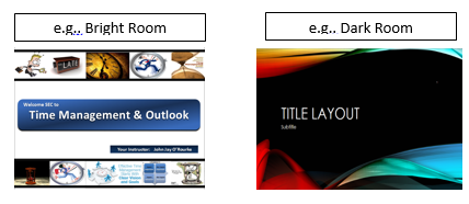
Did you know there is a logical methodology for selecting your background design?
If your presentation will be in a well lit room, then your background should be light in color with dark print. If your presentation is to be in a dark room, with low lighting, then your background should be a dark background with light colored print.
For more power point techniques see our PowerPoint Tips.


