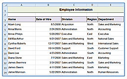
One of the AI powered features, already included with Microsoft Excel, is the Analyze Data function. This function allows you to ask questions about your data and see results, as well as provides sample questions and resulting charts, graphs, and PivotTables to help you visually analyze and represent your data.
To use this feature, when you are on a spreadsheet with a table of data you would like to analyze, click on the Analyze data button on the Home tab on the Ribbon. 
This will open a panel with immediate access to visual ways to analyze your data. 
You can click to insert any of the various items in the panel, which will insert or create additional tabs with your selected PivotTable, charts or graphs.

If you want to ask a specific questions about your data, you can type it into the question box and it will give you visual representation information regarding that question.

All of these tools allow you to create visual charts and PivotTables in seconds. This can provide a more express tool for Excel experts, or help novice users create these visuals without any training or experience.
For more Excel and AI techniques see our full blog of tips.


