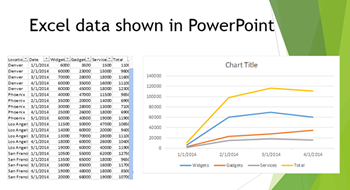
Large charts can overwhelm a presentation with too much information in too little time. One good way to break up a large amount of data into digestible chunks is by animating charts in PowerPoint.
Instead of splashing a complex graph on your presentation screen, ease in each section or line with entrance effects. Animating charts in PowerPoint makes this possible.
Inserting a chart in PowerPoint
 In the Illustrations group under the Insert tab, one of the options is Chart. Click on that and choose the style of chart you want to use. Excel will open in a separate window with space for the data. You can paste your data in here to manipulate the numbers on the chart.
Adding animation to PowerPoint
Once you’ve finished building your chart and changing the numbers, you can add animation. Select the chart, then click on the Animation tab and choose an Entrance Animation (or any other you might prefer). The animation will play, making the entire chart appear at once.
Dividing up an animation in PowerPoint
 For more effect, let’s have each of the lines, bars, or sections in the chart appear in sequence. To do this, you’ll need to open the Animation Pane. Under the Animation tab, while you have your chart selected, click on Animation Pane. A pane on the right hand side of the screen will appear.
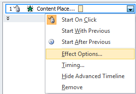
Click on the drop down arrow to the side of the animation listed in that pane, and choose Effect Options. Then, click on the Chart Animation tab of the new pop up window. Beside Group chart by, choose a different option from As One Object. The specific options available here will be different, depending on which type of chart you are using.
 To test your chart animation, click on Play in the animation pane.
The animation can be edited in very detailed ways using the animation pane.
Animating charts in PowerPoint adds impact and makes the information more digestible.
For more on how to animate your presentations, take our PowerPoint Advanced – Making Things Move course.


